Nov 2024
Evolving Toolbar Editing Experience
Category: User Research | Information Architecture
Challenges
In late 2024, Goodnotes 6 began encountering new challenges as our suite of tools and editing capabilities continued to expand. Increasing complexity has made the user experience more overwhelming, and adapting our interface for desktop and mobile platforms has proven difficult, given that our foundational UI and interaction patterns were primarily designed for iPad and tablet use.
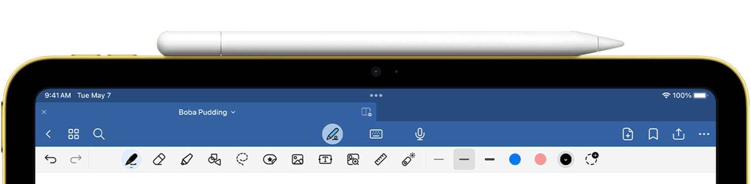
Previously, we grouped all tools under “Write” tools, even though items like images, text boxes, and rulers aren’t necessarily related to writing.
- Users often see us as an iPad-only writing tool : unless we shift this perception through our tool design, expanding into professional desktop and other platforms will be limited.
- Tool Discovery & Organization: New functionality frequently lacks clear prioritization and guiding principles for discovery and presentation within our increasingly crowded single-row toolbar interface.
- Object Interaction Model: The application lacks an intuitive mechanism for selecting and modifying note objects during the editing process. Historically, our interaction design has been optimized primarily for touch and stylus input, creating limitations when compared to competitors like Freeform.
- Evolving Use Case Support: There is an increasing need for prominent access points to new capabilities such as AI-assisted editing, collaboration features, and expanded functionality beyond traditional note-taking. These requirements necessitate a fundamental restructuring of our document editing interface.
Research phase
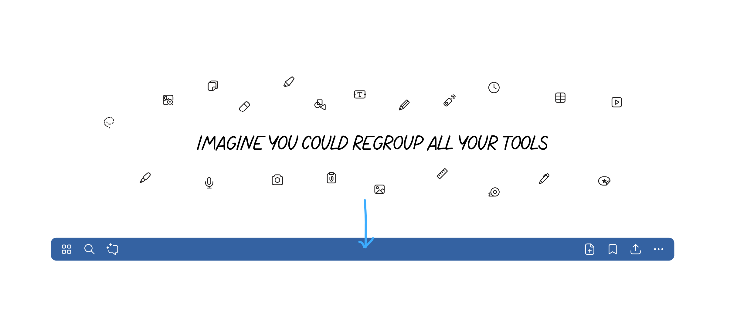
How might we organize and surface editing tools so people can quickly access core writing actions, easily find insert/media options, and personalize the toolbar to match their workflow, while allowing the system to smartly adapt based on usage?
Competitive analysis
since we are also looking into expanding our note taking experience into infinite canvas, where there is no page boundary while user is adding and collaborating with others, we looked at design patterns from key players such as Freeforms, FigJam, Onenote, Miro and a few others.
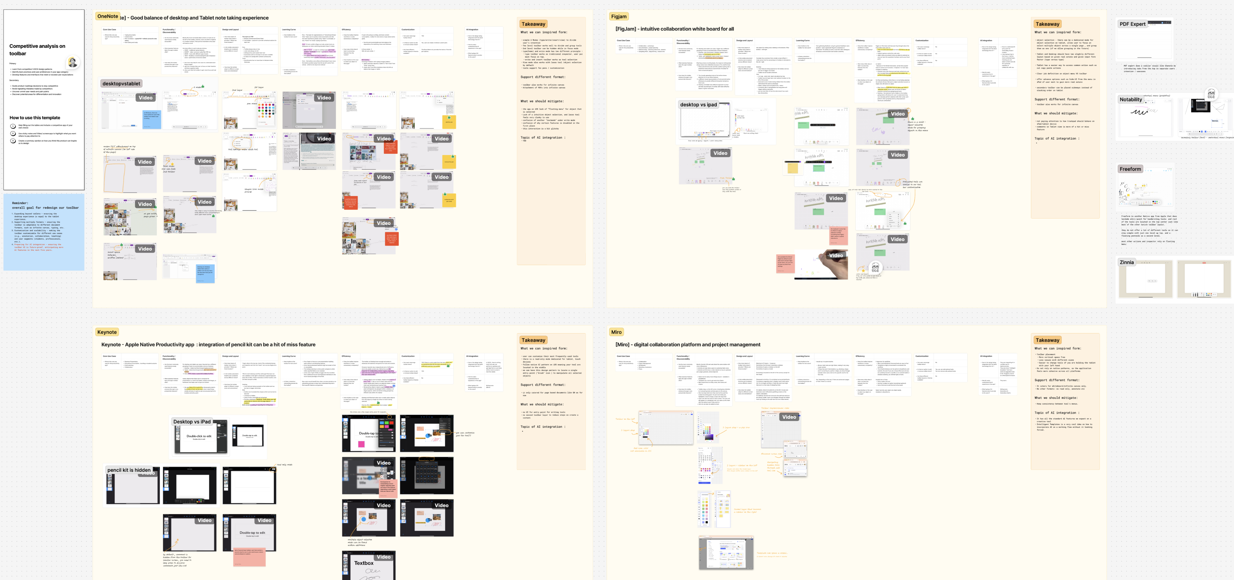
Synthesis boards compiling the competitive scan and key takeaways across scenarios.
Card-sorting exercises
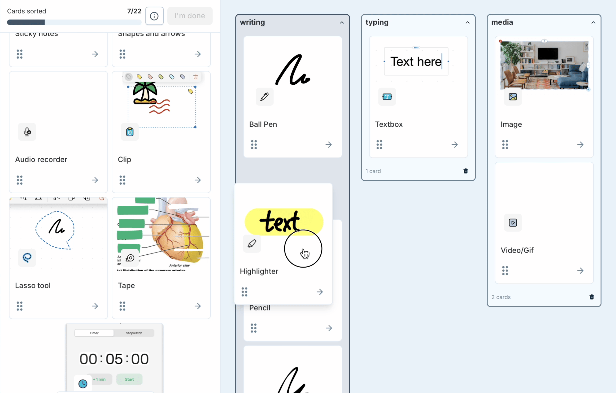
during our unmoderated research , we gave our existing user a brief and tell them to reimagine a new regroup of their tools into the middle section of the toolbar.
Through card-sorting exercises, I evaluated group names and gained insights into users’ mental models. Responding to the “what if” statement, participants sorted and grouped all tools and features from the left to the right.
After collecting all the data, the similarity matrix in the provided image above represents the degree of correlation or overlap in usage between different tools or features. Each cell shows a numerical value that quantifies how often two tools are used together or how similar their usage patterns are among users. Higher values (closer to 100) indicate greater similarity or co-occurrence, while lower values (closer to 0) suggest less similarity.
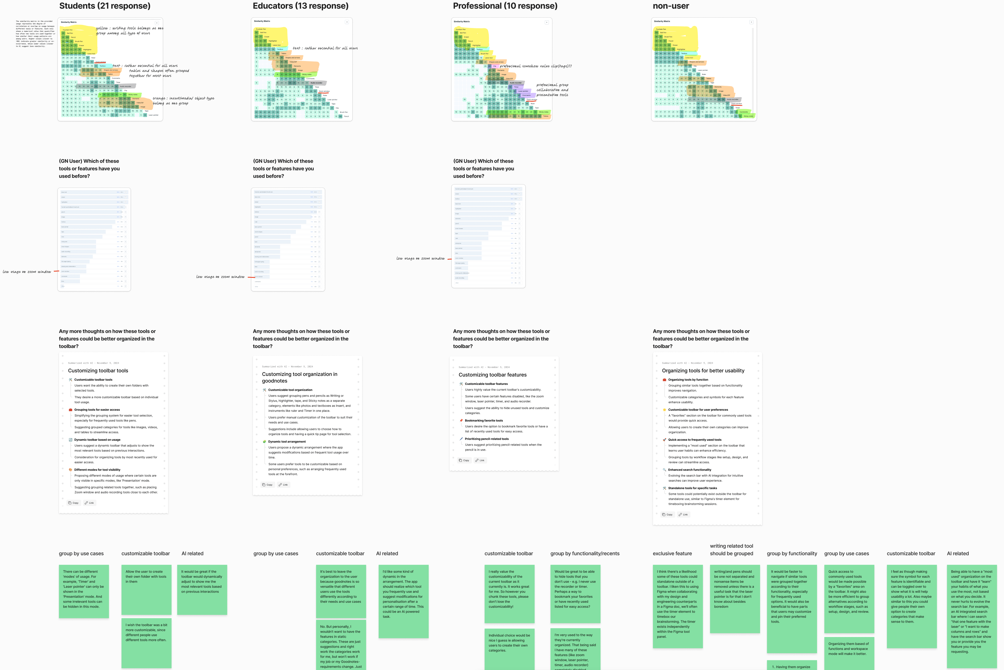
Summarized feedback about organizing tools, customization, dynamic surfacing by usage, and mode‑based visibility.
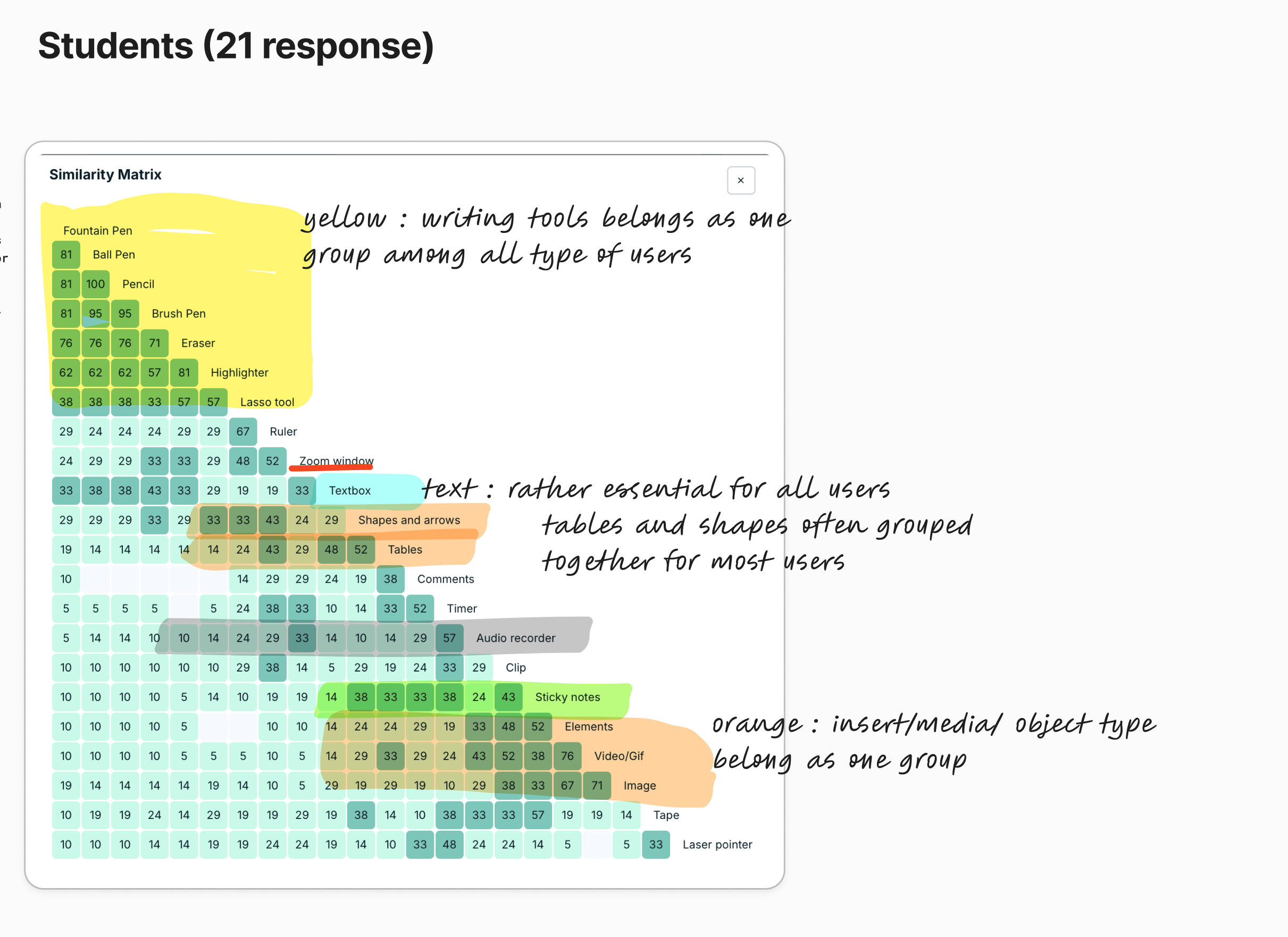
Similarity and co‑usage of tools across user groups (in this case - Student) to discover natural clusters and essentials.
Insights /Takeaway
Having analyzed both competitor UX patterns and insights from our research and surveys, we can now establish guiding ideas for the next steps in restructuring and prototyping.
Thanks to Figjam AI summarization, I can wrap up all findings in a day and align them with my analysis after reviewing participant feedback.
Information architecture restructuring & early prototype
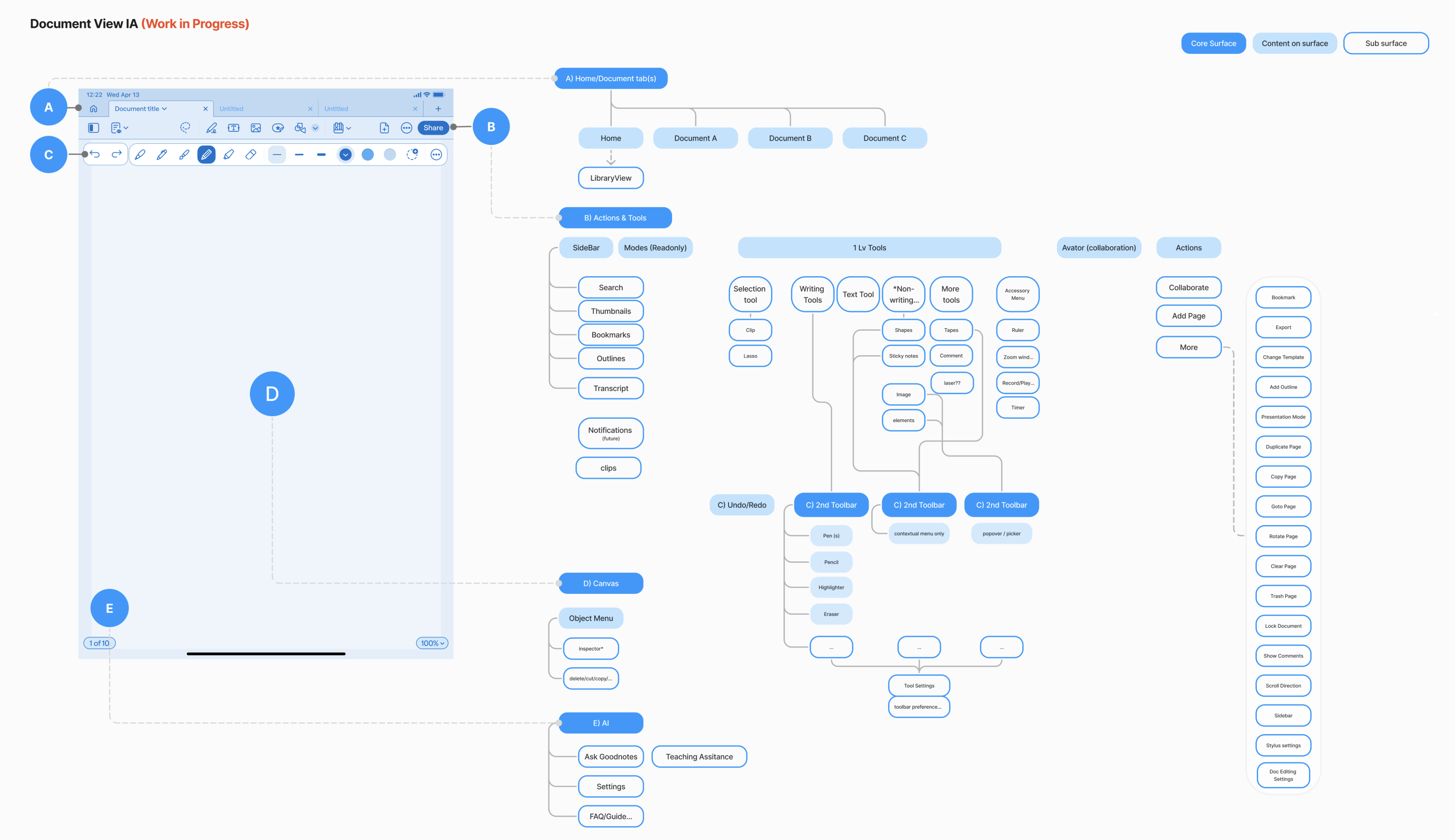
Mockups or flow diagrams demonstrating interaction patterns and revised layouts for toolbars
Redefining Goodnotes: A Unified, Future-Ready Editing Experience for All Users
In 2026, we’re launching the new Goodnotes with an updated toolbar and a new whiteboard feature, allowing users to boost productivity without page size limits. Watch the full YouTube video here.
By fundamentally regrouping and reorganizing our editing tools based on direct user feedback and competitive analysis, we have redefined Goodnotes from a perceived iPad-only writing application into a versatile platform supporting both desktop and mobile experiences. Writing tools are now unified under a clear primary group, while supporting tools such as images, text boxes, shapes, and rulers have been re-categorized and surfaced with enough affordance to enhance users’ ability to discover and switch between functionalities on the go. Through this process, we’ve established clear prioritization and guiding principles for tool discovery, designed an intuitive object interaction model accessible across input types, and introduced prominent access points for advanced features like AI-assisted editing and collaboration. These changes collectively support evolving user needs and ensure our interface is prepared not only for today’s workflows, but for future expansion beyond traditional note-taking.
Special Thanks
A huge thanks to my amazing teammates, researchers, PMs, engineers, and especially my designer Joosep, who played a key role in the toolbar design. We collaborated closely throughout the project—while I focused on research and prototyping, Joosep’s leadership on the toolbar was crucial to our success.
Nov 2024
Evolving Toolbar Editing Experience
Category: User Research | Information Architecture
Challenges
In late 2024, Goodnotes 6 began encountering new challenges as our suite of tools and editing capabilities continued to expand. Increasing complexity has made the user experience more overwhelming, and adapting our interface for desktop and mobile platforms has proven difficult, given that our foundational UI and interaction patterns were primarily designed for iPad and tablet use.
Previously, we grouped all tools under “Write” tools, even though items like images, text boxes, and rulers aren’t necessarily related to writing.
- Users often see us as an iPad-only writing tool : unless we shift this perception through our tool design, expanding into professional desktop and other platforms will be limited.
- Tool Discovery & Organization: New functionality frequently lacks clear prioritization and guiding principles for discovery and presentation within our increasingly crowded single-row toolbar interface.
- Object Interaction Model: The application lacks an intuitive mechanism for selecting and modifying note objects during the editing process. Historically, our interaction design has been optimized primarily for touch and stylus input, creating limitations when compared to competitors like Freeform.
- Evolving Use Case Support: There is an increasing need for prominent access points to new capabilities such as AI-assisted editing, collaboration features, and expanded functionality beyond traditional note-taking. These requirements necessitate a fundamental restructuring of our document editing interface.
Research phase
How might we organize and surface editing tools so people can quickly access core writing actions, easily find insert/media options, and personalize the toolbar to match their workflow, while allowing the system to smartly adapt based on usage?
Competitive analysissince we are also looking into expanding our note taking experience into infinite canvas, where there is no page boundary while user is adding and collaborating with others, we looked at design patterns from key players such as Freeforms, FigJam, Onenote, Miro and a few others.
How might we organize and surface editing tools so people can quickly access core writing actions, easily find insert/media options, and personalize the toolbar to match their workflow, while allowing the system to smartly adapt based on usage?
Card-sorting exercises
during our unmoderated research , we gave our existing user a brief and tell them to reimagine a new regroup of their tools into the middle section of the toolbar.
Through card-sorting exercises, I evaluated group names and gained insights into users’ mental models. Responding to the “what if” statement, participants sorted and grouped all tools and features from the left to the right.
After collecting all the data, the similarity matrix in the provided image above represents the degree of correlation or overlap in usage between different tools or features. Each cell shows a numerical value that quantifies how often two tools are used together or how similar their usage patterns are among users. Higher values (closer to 100) indicate greater similarity or co-occurrence, while lower values (closer to 0) suggest less similarity.
Summarized feedback about organizing tools, customization, dynamic surfacing by usage, and mode‑based visibility.
Similarity and co‑usage of tools across user groups (in this case - Student) to discover natural clusters and essentials.
Insights /Takeaway
Having analyzed both competitor UX patterns and insights from our research and surveys, we can now establish guiding ideas for the next steps in restructuring and prototyping.
Thanks to Figjam AI summarization, I can wrap up all findings in a day and align them with my analysis after reviewing participant feedback.
Information architecture restructuring & early prototype
Mockups or flow diagrams demonstrating interaction patterns and revised layouts for toolbars
Redefining Goodnotes: A Unified, Future-Ready Editing Experience for All Users
In 2026, we’re launching the new Goodnotes with an updated toolbar and a new whiteboard feature, allowing users to boost productivity without page size limits. Watch the full YouTube video here.
By fundamentally regrouping and reorganizing our editing tools based on direct user feedback and competitive analysis, we have redefined Goodnotes from a perceived iPad-only writing application into a versatile platform supporting both desktop and mobile experiences. Writing tools are now unified under a clear primary group, while supporting tools such as images, text boxes, shapes, and rulers have been re-categorized and surfaced with enough affordance to enhance users’ ability to discover and switch between functionalities on the go. Through this process, we’ve established clear prioritization and guiding principles for tool discovery, designed an intuitive object interaction model accessible across input types, and introduced prominent access points for advanced features like AI-assisted editing and collaboration. These changes collectively support evolving user needs and ensure our interface is prepared not only for today’s workflows, but for future expansion beyond traditional note-taking.
Special Thanks
A huge thanks to my amazing teammates, researchers, PMs, engineers, and especially my designer Joosep, who played a key role in the toolbar design. We collaborated closely throughout the project—while I focused on research and prototyping, Joosep’s leadership on the toolbar was crucial to our success.
Nov 2024
Evolving Toolbar Editing Experience
Category: User Research | Information Architecture
Challenges
In late 2024, Goodnotes 6 began encountering new challenges as our suite of tools and editing capabilities continued to expand. Increasing complexity has made the user experience more overwhelming, and adapting our interface for desktop and mobile platforms has proven difficult, given that our foundational UI and interaction patterns were primarily designed for iPad and tablet use.
Previously, we grouped all tools under “Write” tools, even though items like images, text boxes, and rulers aren’t necessarily related to writing.
- Users often see us as an iPad-only writing tool : unless we shift this perception through our tool design, expanding into professional desktop and other platforms will be limited.
- Tool Discovery & Organization: New functionality frequently lacks clear prioritization and guiding principles for discovery and presentation within our increasingly crowded single-row toolbar interface.
- Object Interaction Model: The application lacks an intuitive mechanism for selecting and modifying note objects during the editing process. Historically, our interaction design has been optimized primarily for touch and stylus input, creating limitations when compared to competitors like Freeform.
- Evolving Use Case Support: There is an increasing need for prominent access points to new capabilities such as AI-assisted editing, collaboration features, and expanded functionality beyond traditional note-taking. These requirements necessitate a fundamental restructuring of our document editing interface.
Research phase
How might we organize and surface editing tools so people can quickly access core writing actions, easily find insert/media options, and personalize the toolbar to match their workflow, while allowing the system to smartly adapt based on usage?
Competitive analysissince we are also looking into expanding our note taking experience into infinite canvas, where there is no page boundary while user is adding and collaborating with others, we looked at design patterns from key players such as Freeforms, FigJam, Onenote, Miro and a few others.
Card-sorting exercises
during our unmoderated research , we gave our existing user a brief and tell them to reimagine a new regroup of their tools into the middle section of the toolbar.
Through card-sorting exercises, I evaluated group names and gained insights into users’ mental models. Responding to the “what if” statement, participants sorted and grouped all tools and features from the left to the right.
After collecting all the data, the similarity matrix in the provided image above represents the degree of correlation or overlap in usage between different tools or features. Each cell shows a numerical value that quantifies how often two tools are used together or how similar their usage patterns are among users. Higher values (closer to 100) indicate greater similarity or co-occurrence, while lower values (closer to 0) suggest less similarity.
Summarized feedback about organizing tools, customization, dynamic surfacing by usage, and mode‑based visibility.
Similarity and co‑usage of tools across user groups (in this case - Student) to discover natural clusters and essentials.
Insights /Takeaway
Having analyzed both competitor UX patterns and insights from our research and surveys, we can now establish guiding ideas for the next steps in restructuring and prototyping.
Thanks to Figjam AI summarization, I can wrap up all findings in a day and align them with my analysis after reviewing participant feedback.
Information architecture restructuring & early prototype
Mockups or flow diagrams demonstrating interaction patterns and revised layouts for toolbars
Redefining Goodnotes: A Unified, Future-Ready Editing Experience for All Users
In 2026, we’re launching the new Goodnotes with an updated toolbar and a new whiteboard feature, allowing users to boost productivity without page size limits. Watch the full YouTube video here.
By fundamentally regrouping and reorganizing our editing tools based on direct user feedback and competitive analysis, we have redefined Goodnotes from a perceived iPad-only writing application into a versatile platform supporting both desktop and mobile experiences. Writing tools are now unified under a clear primary group, while supporting tools such as images, text boxes, shapes, and rulers have been re-categorized and surfaced with enough affordance to enhance users’ ability to discover and switch between functionalities on the go. Through this process, we’ve established clear prioritization and guiding principles for tool discovery, designed an intuitive object interaction model accessible across input types, and introduced prominent access points for advanced features like AI-assisted editing and collaboration. These changes collectively support evolving user needs and ensure our interface is prepared not only for today’s workflows, but for future expansion beyond traditional note-taking.
Special Thanks
A huge thanks to my amazing teammates, researchers, PMs, engineers, and especially my designer Joosep, who played a key role in the toolbar design. We collaborated closely throughout the project—while I focused on research and prototyping, Joosep’s leadership on the toolbar was crucial to our success.